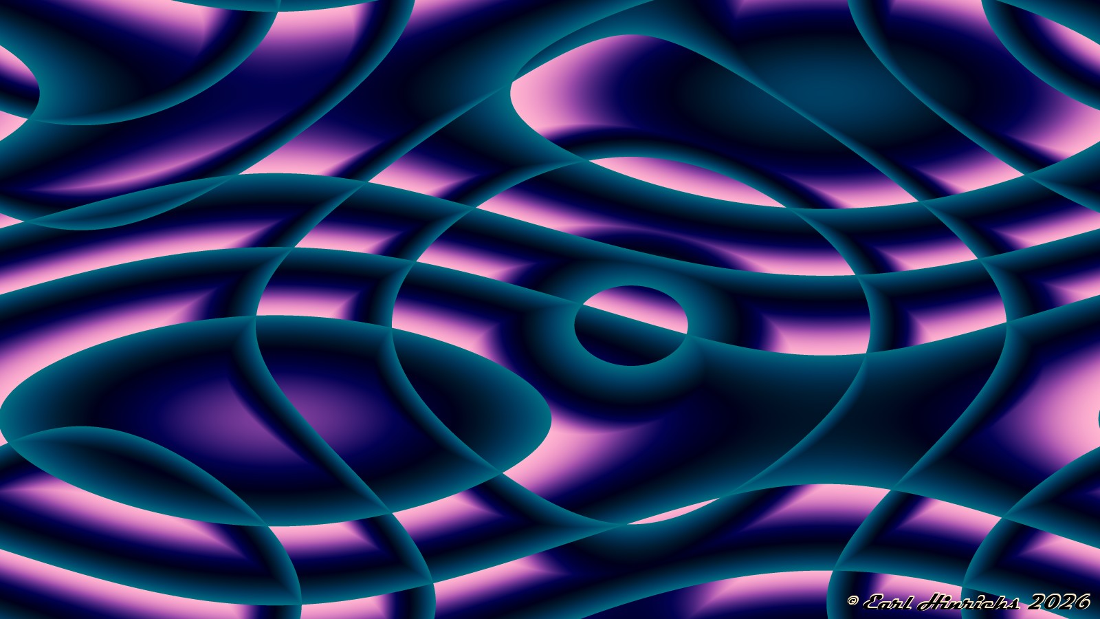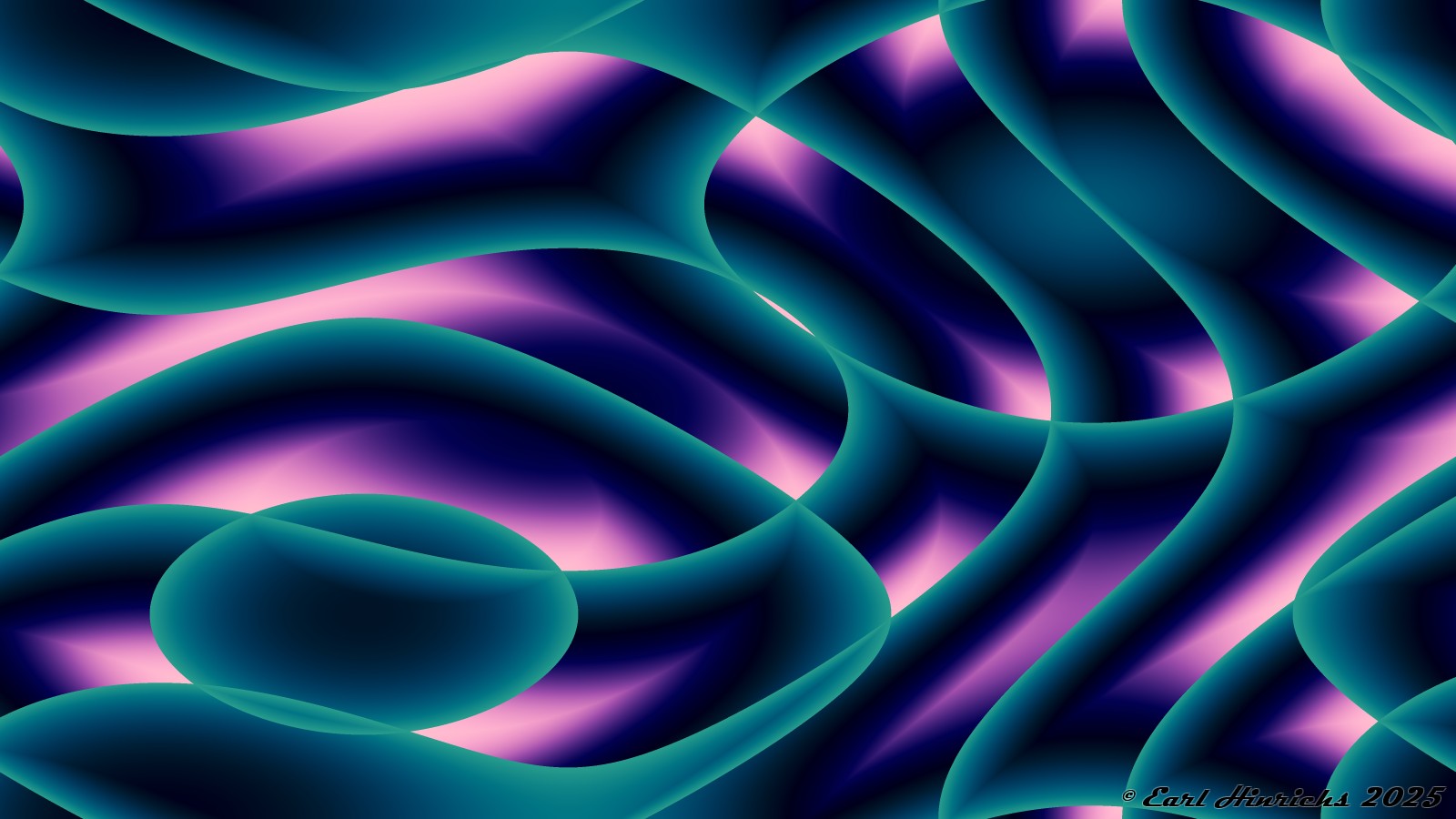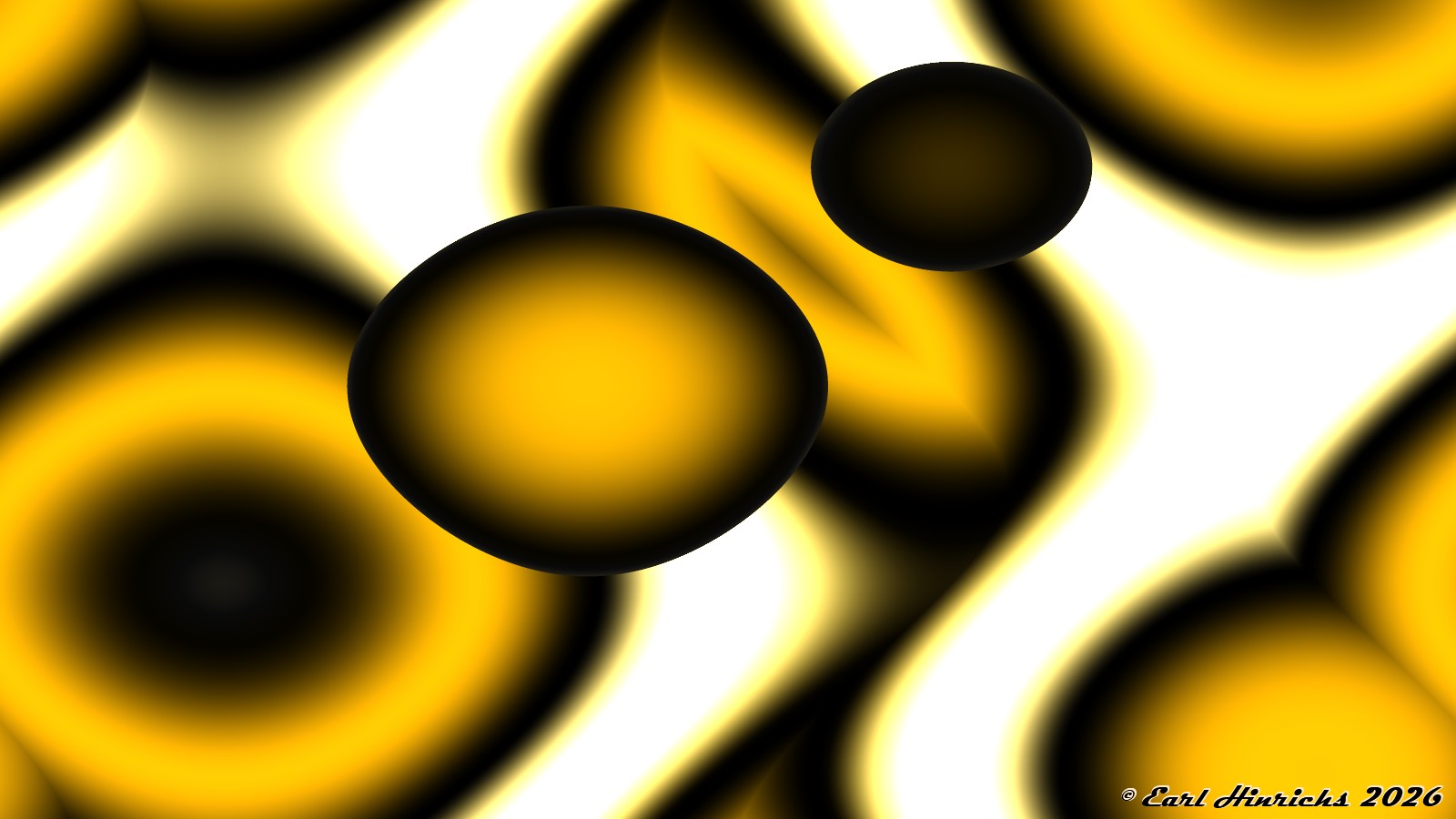
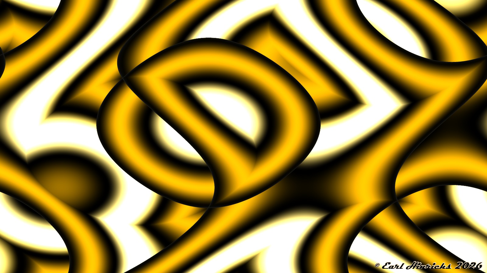
The previous piece stood out in my mind because of the smooth blending of translucent colors. It also had sharp edges and a few texture lines. I decided to remove the edges and lines and then focus on the color blending.
Janus #27

The previous piece stood out in my mind because of the smooth blending of translucent colors. It also had sharp edges and a few texture lines. I decided to remove the edges and lines and then focus on the color blending.
Here is another one that was set aside and forgotten. I have resurrected it and generated a few variation for the current series.
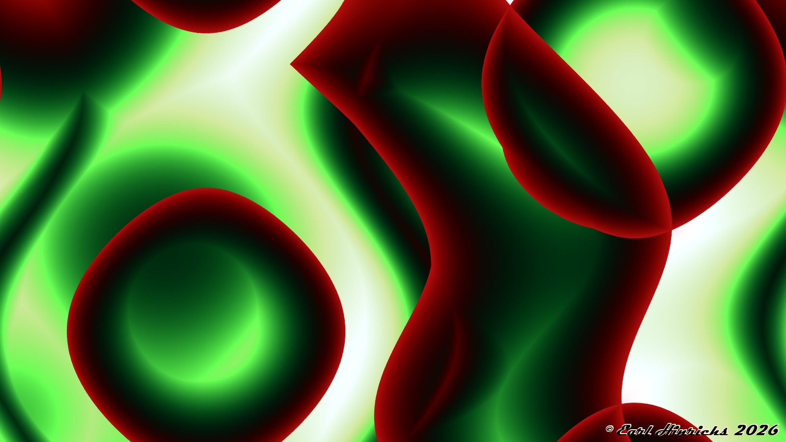
It has smooth blending colors, with larger regions introducing new colors.
I like when there is a noticeable change in density across an image. But after letting the previous work mature for a few days, it started to feel like I tried to cram in too much. Here is a (not wholly accurate) “zoom” of the central figure.
Here is a something with a slightly redder palette.
The yellow-gold palette again, but I did not try to fill up the whole page.
I looked through the Metallic Flow series trying to determine if I had already published the previous two. Of course, I am easily distracted. Here are two new ones inspired by Metallic Flow #6.
I have notes that list this one and the next as published. But I cannot find them on the website. I created these around the Metallic Flow time period. I may have decided that they did not fit at some point.
Anway, they are too good to waste, so I am publishing them now, with a little tweaking and cleanup.
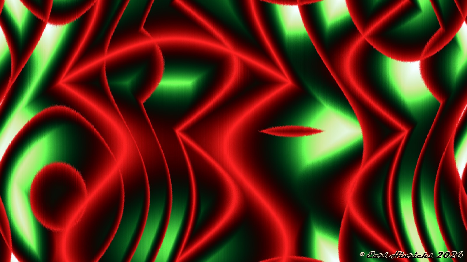
Bright colors, with a dark/light struggle.