Skip to content
Spyke Art
21st Century Computer Art
Home
Blog
About
Contact
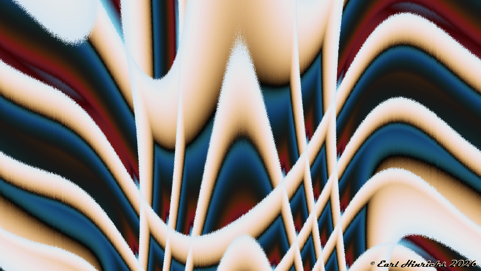
Cylinder Art #25
Posted on
2026-02-21
2026-01-16
by
earl
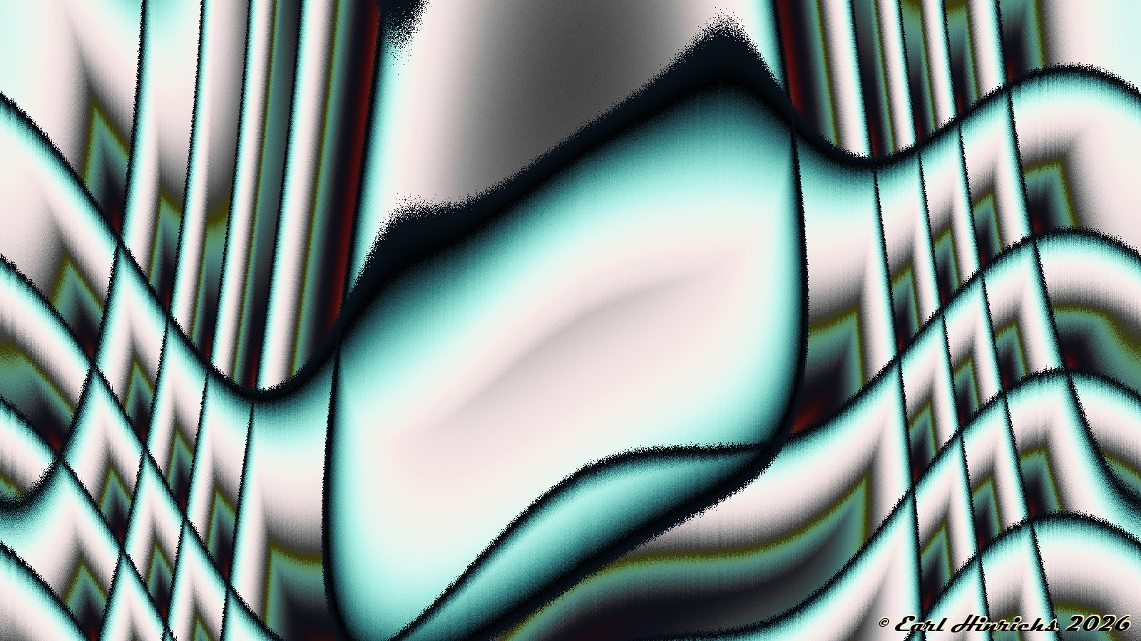
Cylinder Art #24
Posted on
2026-02-20
2026-01-16
by
earl
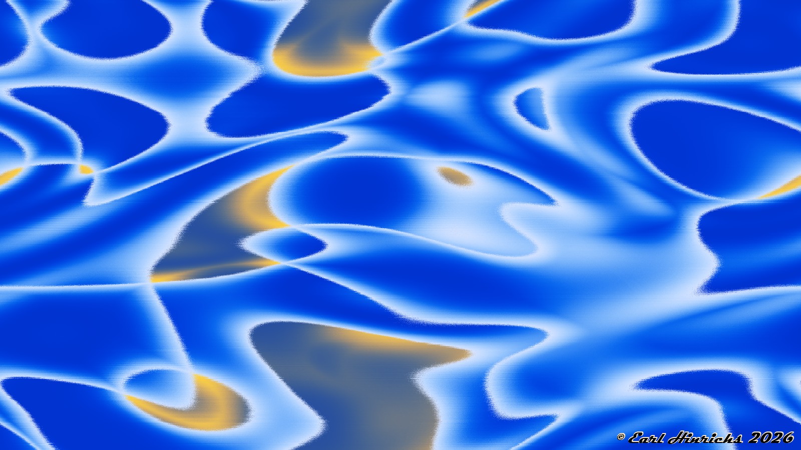
Cylinder Art #23
Posted on
2026-02-18
2026-01-16
by
earl
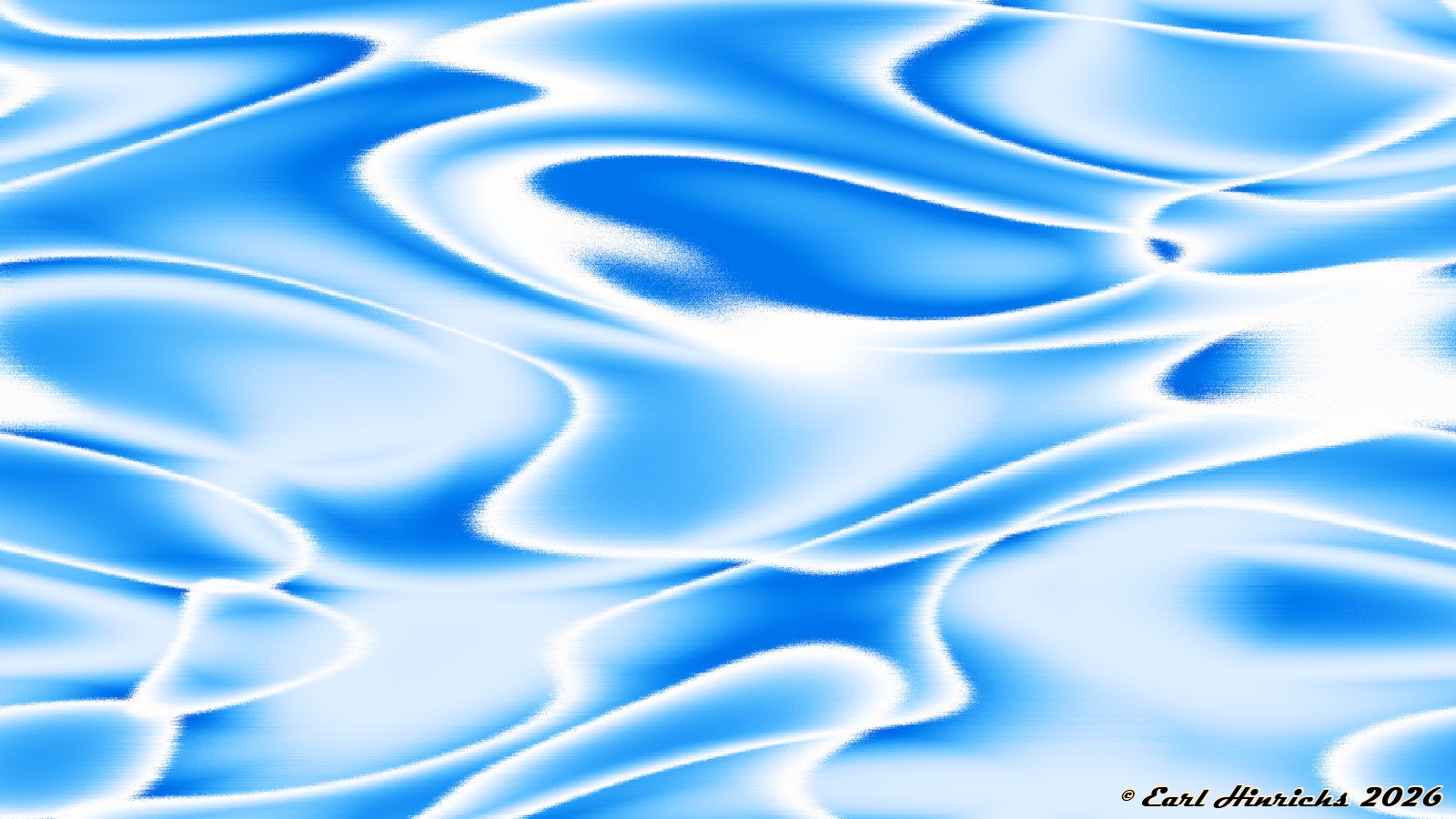
Cylinder Art #22
Posted on
2026-02-16
2026-01-16
by
earl
Cylinder Art #21
Posted on
2026-02-14
2026-01-16
by
earl
Cylinder Art #20
Posted on
2026-02-12
2026-01-16
by
earl
Cylinder Art #19
Posted on
2026-02-10
2026-01-16
by
earl
Cylinder Art #18
Posted on
2026-02-08
2026-01-16
by
earl
Cylinder Art #17
Posted on
2026-02-06
2026-01-16
by
earl
Cylinder Art #16
Posted on
2026-02-05
2026-01-16
by
earl
Posts navigation
Older posts
Newer posts