
Janus #34
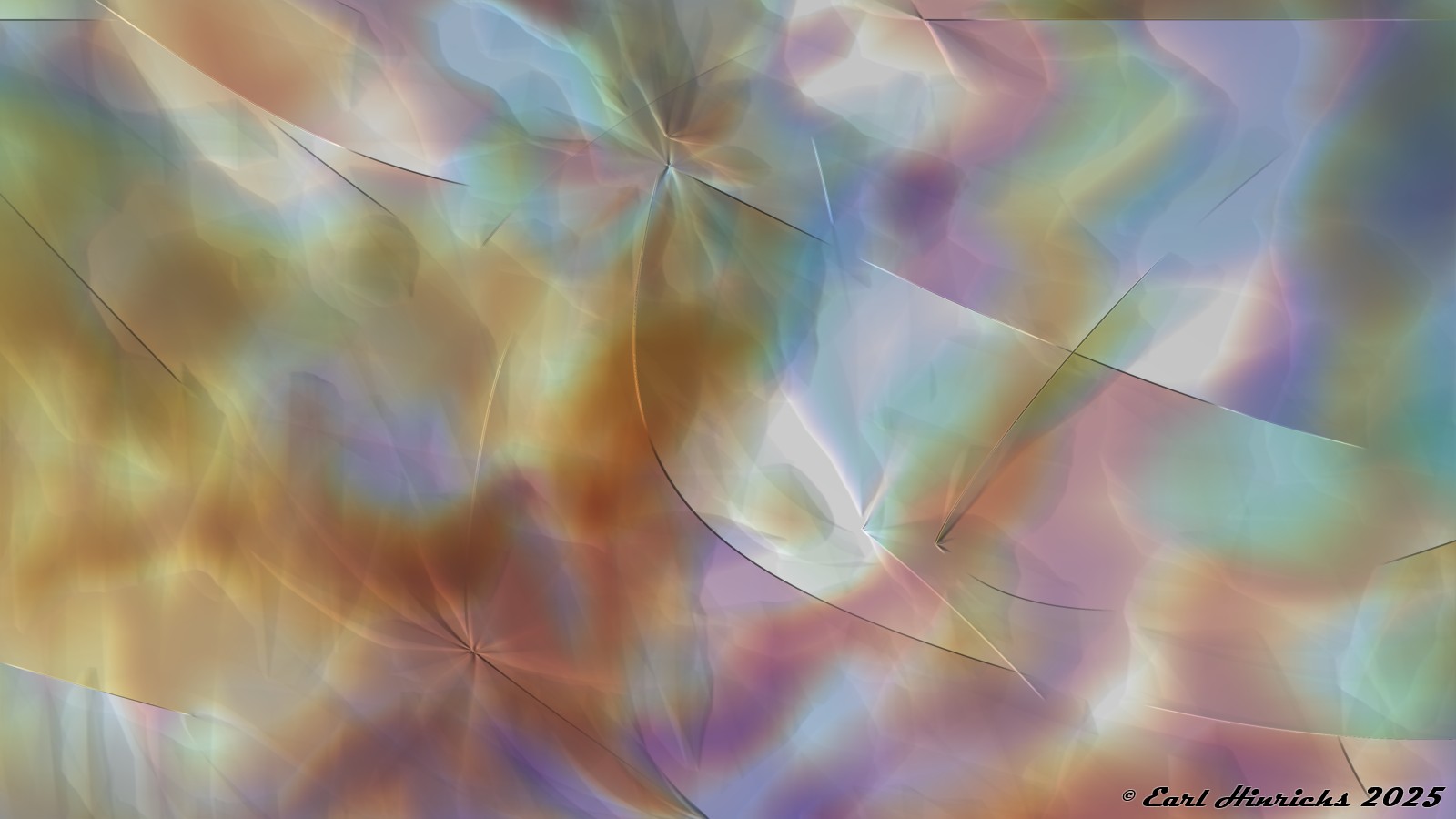
I pulled Janus #26 from some previous work for further development. In the posts that followed, I removed the folds and edges. I wanted a smooth blending of the colors.
After going down that path a few steps, I decided to return and embrace the folds and edges.
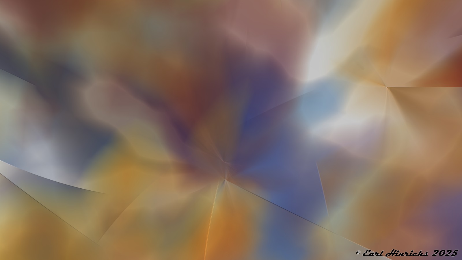
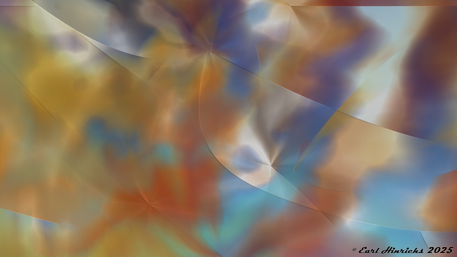
A few more follow. No sharp edges or texture lines.
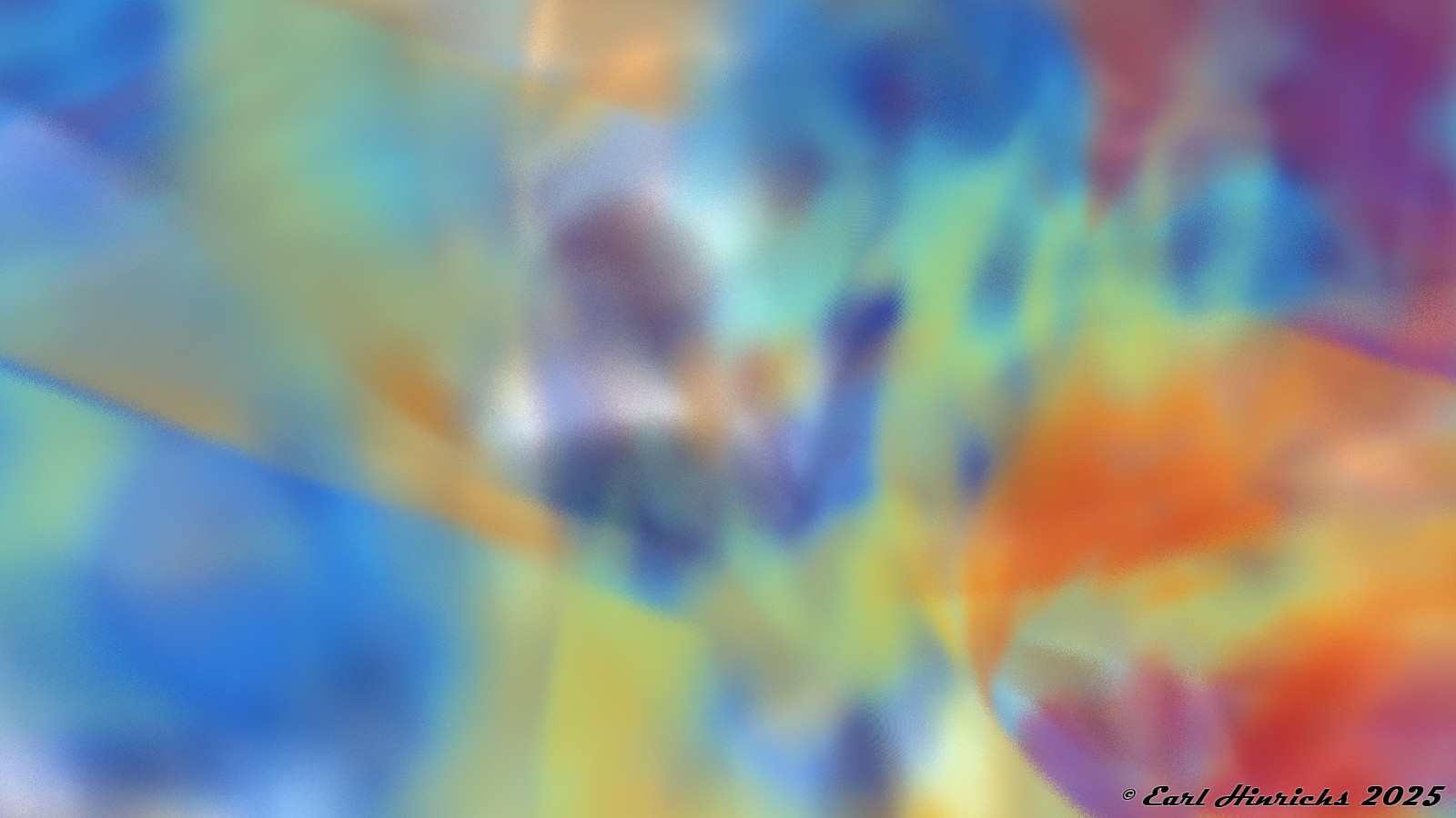
Despite the previous comments (Janus #28), I do not want to abandon this idea yet. Here I stick with the blended, blurred colors, but with more going on. The line between “blurred background”, and “intriguing abstract art with blurred colors” may be hard to define. I am comfortable that this one is on the good side of that line.